According to the principles of Harmochromy, it is important to choose the right palette for the rooms in your home. But what does this mean in concrete terms?
Let’s start from the beginning. Harmochromy (a term brought to the attention by Rossella Migliaccio in her 2019 best seller) has become a very popular theme in relation to cosmetics and clothing. As the word itself suggests, it involves identifying shades that are in harmony with the complexion as well as hair and eye colour. The set of colours that best suit a person is called a palette. Today, it is very common to classify these palettes into ‘seasons‘ and their subgroups.
Knowing whether we are more ‘winter‘ or more ‘spring‘ is a useful guide for choosing a dress or make-up, but what does this have to do with interior design and especially with art?
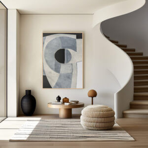
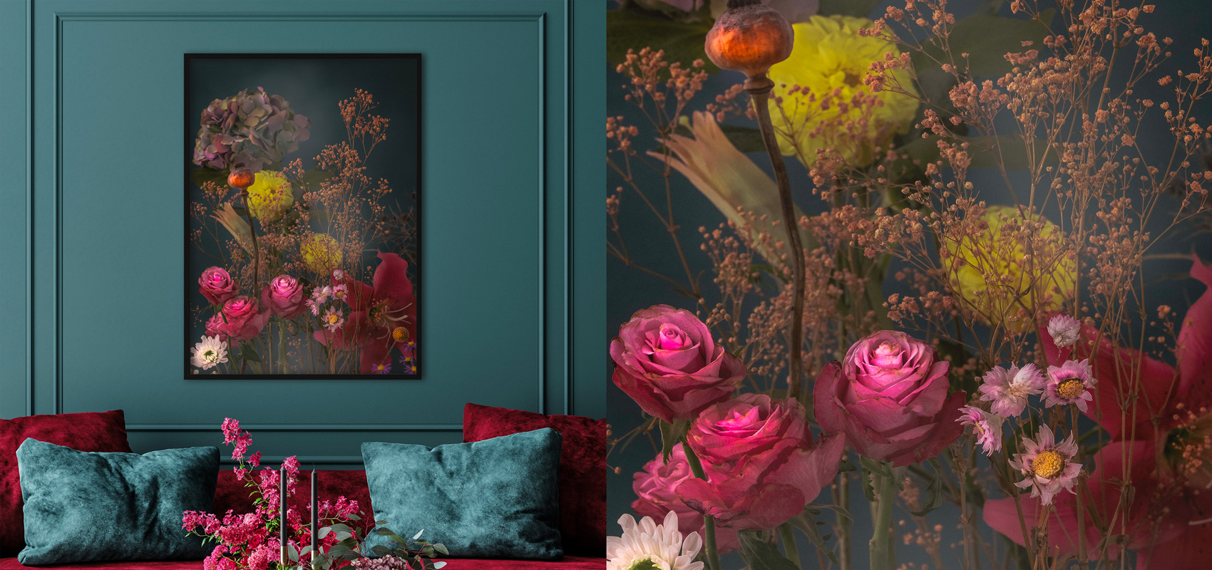
In fact, the principles of Harmochromy do not only apply to the person, but also apply to the spaces in which we live. Finding the right palette for the rooms in one’s home, as suggested by the experts in colour matching, does not only mean matching colours well with each other, but also exploiting them to act on people’s perception of space and wellbeing. Colours and shades are elements that interior designers must take into account to ensure balance in the furnishings, also in relation to the purpose of the room itself and the personality of the person living in it. Depending on the colours chosen, for example, a kitchen may convey an idea of order, or liveliness or warmth. For a bedroom we will probably choose relaxing tones. But what counts is not the colour itself: it is above all the combinations. Just like sounds, colours can be ‘out of tune’, jarring, pleasant or engaging. Colours can also be ‘cumbersome’: a dark palette will give the idea of a more cosy and intimate environment, but if you overdo it you risk giving a sense of seclusion. Very light colours enhance the space in the home, but can be cold and anonymous. In short, it’s all about delicate balancing acts, and of course the artwork must also contribute to the overall effect. This is why, when applying harmonisation to the rooms of a home, the palette must also be respected when choosing works of art. Indeed, in some cases one can start from the artwork itself and be guided by it. The peculiarity of artists is precisely that of knowing how to choose tones and combinations to communicate and arouse emotions, which is why interior designers can also choose to be inspired by a painting or a photograph when deciding on the colours of a piece of furniture. If you want to see some examples, visit the pages of the artists of Cinquerosso Arte and you will notice that the placement of works in the various rooms is done in respect of the palette, in perfect harmony.